

Slim Pickens as Major Kong Riding the Atom Bomb in Dr. Strangelove
The greatest trick Google ever pulled was convincing the world there was a Mobilegeddon. Sure, a mobile-focused algorithm update occurred on April 21. And according to the Google Search team, this update had a bigger impact than Penguin and Panda combined. A number of excellent studies have shown that there was a smaller-than-expected real-world impact of the mobile update, so we won’t rehash that specific point in this post.
What we do want to discuss here is the opportunity afforded by the move to mobile usage, and in doing so, try to shift the terms of the discussion. Mobilegeddon is an apocalyptic, destructive term, fraught with fear, uncertainty and doubt, and it’s time to let it go, because we’re actually in an age of Mobile Nirvana.
Mobile Maturing
Almost any study of mobile and desktop Internet usage shows mobile overtaking (or poised to overtake) desktop as the primary source of digital media consumption. For example, Mary Meeker’s annual Internet Trends report shows mobile-based digital consumption at 51% in 2015:
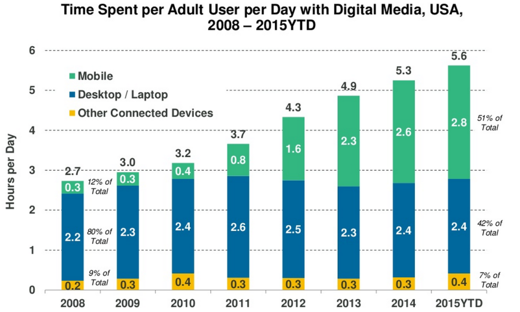
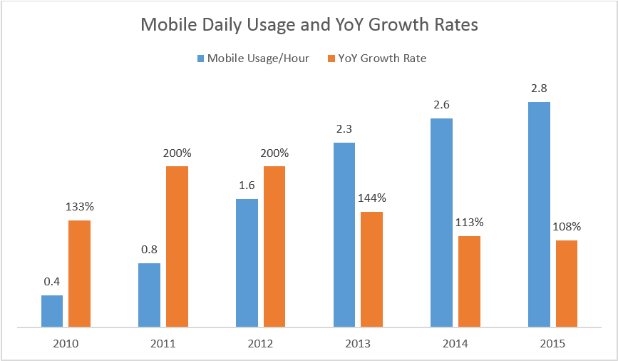
If we dive deeper into her data, we can see that the mobile shift has been happening for a while, and as she points out, although mobile continues to grow, the mobile market is inevitably slowing, with the rate of mobile growth declining for three straight years, from 2013 – 2015:
All this is to say that the shift to mobile has been happening for a very long time, and is reaching a degree of maturity, which accounts for the slowdown in percentage growth. Publishers who have kept a keen eye on their analytics and audience trends have known about the smartphone and tablet increases for at least three to five years.
Google’s mobile update was a catch-up algorithmic change, and based on this data, arguably very late in arriving. In that sense Google’s mobile update – and their dire predictions about non-compliance – could be viewed as an incentive to get hold-outs to become mobile friendly. Predictably, sites that continued to resist the implementation of a mobile-friendly view lost market share, like Reddit. But by-and-large, publishers who have been winning the Internet were mobile-friendly long before the term “Mobilegeddon” was ever uttered, and were poised to succeed as a result.
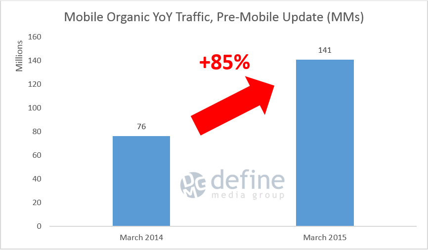
The data bears this out. During the 18 month period from January 2014 – June 2015, our clients had 2.5BB organic mobile visits in aggregate, and the majority them had a functional mobile implementation in place well before Google’s announcement of the mobile update in February 2015. And those who didn’t worked hard to become mobile-friendly well in advance of April 21. If we look at March 2015 mobile organic search numbers, in the month before Google’s mobile update rolled out, our clients had 85% year-over-year mobile organic growth compared to March 2014:
In June of this year, after the mobile update had a chance to fully roll out, year-over-year mobile organic numbers rose higher, showing 98% growth:
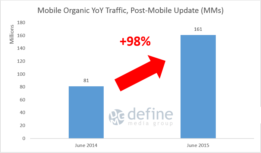
There are two important points to make about this data. The first is that the story of mobile organic growth, for sites that were mobile friendly, is an overwhelmingly positive one, yielding a near triple-digit increase year-over-year for publishers who had the foresight to lay the groundwork for this transition. There was no sign of chaos, no sites left in tatters, no revenue gone up in flames – instead there was an additional lift in traffic from an already sizeable channel.
The second, which we’ll discuss in more detail below, is that our analysis shows that the three major types of mobile implementations – Responsive, Dynamic Serving and Separate URLs – have seen similar rates of growth for a significant period of time, including after the April 21 update.
So although Google has publicly espoused Responsive Design as their preferred mobile implementation, they are, as of now, sufficiently supporting Dynamic Serving and Separate URLs. This means publishers have greater freedom in choosing a Dynamic or Separate URL mobile implementation if business or technical needs require. There isn’t an inherent organic search benefit that we can see in one mobile implementation technique versus the others, so this is a constraint that can be removed when choosing which mobile implementation serves your needs.
Responsive v. Dynamic Serving v. Separate URLs
Before we get into the data, here’s a quick definition of these three different mobile implementations:
Responsive design
From Google: Responsive web design is a setup where the server always sends the same HTML code to all devices and CSS is used to alter the rendering of the page on the device.
Responsive design returns the same URL regardless of device.
Dynamic Serving
From Google: Dynamic serving is a setup where the server responds with different HTML (and CSS) on the same URL depending on the user agent requesting the page.
Dynamic serving also returns the same URL regardless of device.
Separate URLs
From Google: In this configuration, each desktop URL has an equivalent different URL serving mobile-optimized content.
Separate URLs typically resolve as m.site.com or www.site.com/m/.
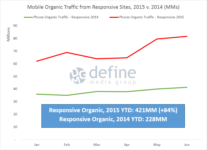
Year-to-Date, mobile organic traffic from responsive sites have grown 84%:
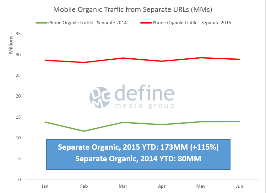
Organic traffic from mobile separate URLs have grown 115%:
And mobile organic traffic from mobile dynamic serving has increased 99%:
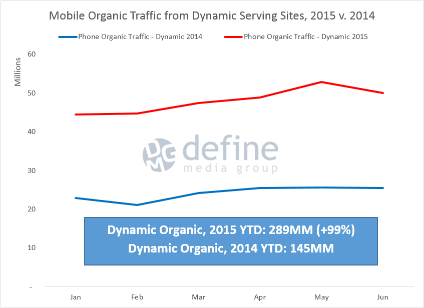
Although the data seems to suggest that responsive design actually had the least growth, it’s important to understand that the majority of our clients use responsive design, so it’s not surprising that the percentage growth for responsive is actually smaller than the others. Instead, the main takeaway should be that when implemented correctly, any of the three major mobile implementations can drive mobile organic growth, and there certainly doesn’t seem to be a bias towards responsive, despite Google’s stated preference, at least as of now.
Mobileheaven? Mobilehalla? Mobilevana?

Image source: https://www.youtube.com/watch?v=9Irzs1Dtppc
Use any paradisiacal metaphorical mashup you wish, the data clearly bears out that rather than a destructive and punitive era for mobile, as the term Mobilegeddon seems to suggest, instead it’s one of tremendous opportunity. As with all things organic, those who were well prepared beforehand are reaping the rewards now, but if you have a site that has yet to be mobile optimized, there’s still a tremendous opportunity for long-term gains. And the data at hand seems to indicate that publishers can choose whichever mobile implementation best fits their business needs, rather than feeling forced to go with any one specific solution.
Tags:
Related Posts
- MozCon Presentation – Dark Search, Mobile and Social – Run Rabbit Run! ( September 29, 2017 )
- MozCon Presentation – Keep the Focus on the Doughnuts ( September 29, 2017 )
- Download Search Console URL Parameters Painlessly with This Handy Bookmarklet ( January 5, 2016 )
- Adam Sherk Speaks on Bloomberg TV: “Why Google News Is Shutting Its Doors in Spain” ( April 14, 2015 )
- The Facebook and Google Duopoly ( April 14, 2015 )
- The 2014 Mid-Year Digital Traffic Report ( July 15, 2014 )
- “No, SEO is Never Dead…It’s Just Trying to Be” – SMX Advanced Presentation ( June 25, 2014 )
- Hey BuzzFeed, Search Traffic is Doing Just Fine ( February 6, 2014 )
- Three Really Big Traffic Problems You May Not Know You Have – Video Presentation ( December 17, 2013 )
- iOS 7 Released: Dark Google Changes for the SEO & Analytics Communities ( October 28, 2013 )
About the Author
This site uses Akismet to reduce spam. Learn how your comment data is processed.
Recent posts
-

MozCon Presentation – Dark Search, Mobile and Social – Run Rabbit Run!
September 29, 2017 at 1:33 PM
-

MozCon Presentation – Keep the Focus on the Doughnuts
September 29, 2017 at 11:54 AM
-

Download Search Console URL Parameters Painlessly with This Handy Bookmarklet
January 5, 2016 at 6:41 AM
-

Mobilegeddon or: How I Learned to Stop Worrying and Love Our New Mobile World
July 27, 2015 at 5:53 AM
Leave a reply